A New Tool for Healthcare Gives Better Outbreak Forecasts
Pinpointing an outbreak’s peak, the approach can boost health systems’ preparedness and risk communication.

Image created with generative AI tools.
During an epidemic, some of the most critical questions for healthcare decision-makers are the hardest ones to answer: When will the epidemic peak, how many people will need treatment at once and how long will that peak level of demand for care last? Timely answers can help hospital administrators, community leaders and clinics decide how to deploy staff and other resources most effectively. Unfortunately, many epidemiological forecasting models tend to struggle with accurately predicting cases and hospitalizations around peaks.
A new approach described in the journal Proceedings of the National Academy of Sciences and led by University of Texas at Austin researchers, builds a critical piece of epidemiological understanding into forecasting models to address these longstanding issues. Rather than simply extrapolating trends from the current outbreak, the approach, known as “epimodulation,” gives the models a more intuitive sense of how epidemics generally tend to evolve.
“It tells the model, in effect, ‘We expect the curve to bend as immunity builds,’ so the model can look for early signs of that slowdown while still learning from the data,” said Lauren Ancel Meyers, Cooley Centennial Professor in UT’s Department of Integrative Biology and director of epiENGAGE, a national center for excellence in forecasting and outbreak analytics. “The result is a better forecast that delivers real-time insight to hospitals and communities when it matters most.”
The team tested its approach on a wide range of models and with actual data from past epidemics of influenza and COVID-19. They found that the approach increased model accuracy by up to 55% during epidemic peaks for hospital admission forecasts, without reducing accuracy at non-peak times. Epimodulation also improved the accuracy of ensemble models, which combine multiple models into one forecast. The results suggest that this can be a powerful new tool for healthcare systems to adapt to quickly evolving epidemics.
Funding for this research was provided by the U.S. Centers for Disease Control and Prevention, the Council for State and Territorial Epidemiologists and Tito’s Handmade Vodka.
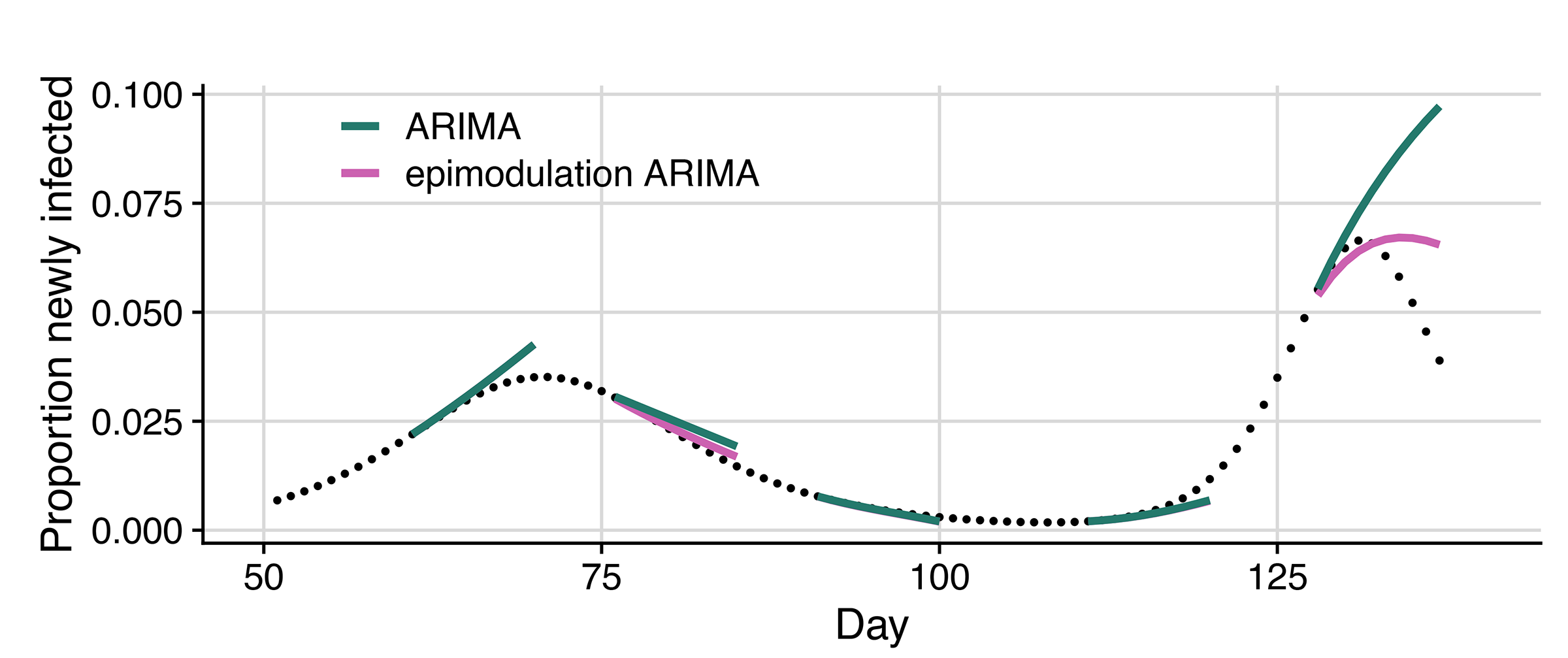
Meyers and her team simulated daily new infections for an epidemic with two peaks. The ARIMA model (green lines) typically overestimated how big the peaks would become and how long they would last. When they used epimodulation with the ARIMA model (pink lines), forecasts matched the curves more closely. Image credit: University of Texas at Austin.
According to Meyers, this approach could be applied to many infectious diseases that spread in waves, including bird flu, Ebola, Mpox and even new pathogens that have yet to emerge. Such wave patterns often arise as immunity builds within a population, as people change their behavior, or as environmental conditions shift.
“Epidemics tend to follow recognizable patterns. They grow very quickly at first, then slow down as more people become immune or change their behavior, eventually peaking and fading,” Meyers said. “Those dynamics reflect basic epidemiological principles—how infections spread, how immunity builds, and how people respond when risk goes up.”
Most forecasting models, especially those based purely on machine learning, don’t “know” any of those epidemiological principles. They essentially look at the recent data and project the trend forward, like extending a line on a graph. They often perform well while cases are rising (or falling) but miss the turning point when growth slows or reverses. Epimodulation can help make forecasting around the peak more realistic.
The paper’s other UT authors are Emily Javan, Susan Ptak and Oluwasegun Ibrahim. Other authors are Graham Gibson at Los Alamos National Laboratory, Spencer Fox at the University of Georgia and Michael Lachmann at the Santa Fe Institute and Arizona State University.